
I'm a huge Cormac McCarthy fan. Blood Meridian is number one in my book, and despite Oprah's best intentions, I enjoyed The Road quite a bit as well. I got even more excited when initial casting news came out that Viggo Mortensen was starring as the father. Then these first set photos came out and now I'm geeked.
"Just how bleak is the movie adaptation of Cormac McCarthy's post-apocalyptic novel The Road, which just finished filming? So grim that the crew would film on overcast, foggy days, and they removed every hint of greenery from the movie's locations.
The Road is set in a burned America, ruined after an unknown disaster. A father (Viggo Mortensen) and son (Kodi Smit-McPhee) embark on a long journey to the coast. In addition to coping with the wrecked countryside, the pair are also stalked by a gang of cannibals. In a new piece, the New York Times describes the movie's look as monotone and bleak, The sky is gray, the rivers are black, and color is just a memory. The landscape is covered in ash, with soot falling perpetually from the air. The cities are blasted and abandoned. The roads are littered with corpses either charred or melted, their dreams."
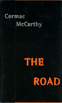
Chip Kidd was in town a couple months ago, talking about designing the cover to "The Road." It was a good story, full of wry humor and details you'd never begin to guess at. I can't find a summary of the speech online, but here's an Esquire interview where he sums it up (in a much more charitable fashion):
"I went through several rounds with McCarthy before it was something he liked. You just never know. All authors are different with how they want this stuff to go.
My original idea was a totally burnt-out car, or one just on the roadside in black and white. The car was either on fire or it was a smoking hulk. I thought that was the best metaphor.
McCarthy wanted something much more austere. He didn't even want his name on the front. We had to gently persuade him that that was not a good idea. So the cover just became this black hole. His name is not all that legible, but it is there. It was kind of a compromise -- 'Okay, your name does have to be there, but it's not going to be screaming.' And it works -- the only colors he describes in the book are various shades of gray, black, and ash with a dash of blood.
The font is one of the oldest tricks in the book. You typeset text in a regular font, I think this was Rotis, and then you blow it up really big on a Xerox machine and then you shrink it down really small. The trick is to see just how much you can distress it and keep it readable. It's gotten harder to do because Xerox machines are so much better, but if you've got a wonderfully shitty machine it will look all corroded and gummy and yucky. It takes a bit of playing around, but it's really not that hard.
It was interesting to see The Road in bookstores amongst all the other stuff -- it called attention to itself by not calling attention to itself. I don't think we took unnecessary chances with it. The text has to be strong for that kind of cover to work for a less established writer, but you could say that about anything. "